
The Quiet Signals of Luxury: What Makes an Interior Feel Premium Without Trying Too Hard
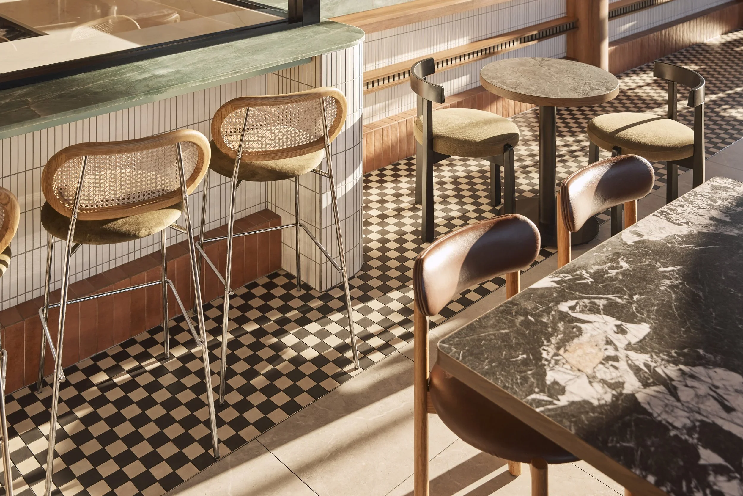
The strongest luxury is often the hardest to name. A room feels expensive before we have identified the stone, recognised the furniture or understood what, precisely, is creating that impression. What we are reading is not price. It is judgement.
Luxury interior design is frequently reduced to a vocabulary of marble, brass, custom joinery and natural stone. Yet materials alone cannot produce sophistication. The difference is usually found in the relationships between things: how much visual information a room contains, where the eye is allowed to rest and how completely the details have been resolved.
Restraint is a form of confidence
Restraint does not require beige walls or minimalist rooms. It is an act of editing. A richly coloured interior can be restrained when its gestures belong to a coherent idea, just as a neutral room can feel excessive when every surface has been treated as an opportunity to perform.
This distinction matters in premium interior design because luxury is easily weakened by overstatement. When every surface is a feature, hierarchy disappears. A considered interior establishes moments of emphasis and gives them enough space to register. Repetition replaces novelty for novelty's sake. Materials recur with purpose. Decorative gestures support the architecture rather than compete with it. The room does not appear anxious to prove its value.
Soul te: richness without excess

At Soul te in Minchinbury, our design reinterpreted the familiar language of the deli and bakery through a contemporary lens. Green marble anchors the interior with weight and permanence, while a brighter palette introduces the warmth and energy associated with an Italian summer. Layered textures and selected finishes create richness, but the concept remains disciplined because those elements are tied to a consistent idea of family, culture and gathering.
The project is useful precisely because it challenges the assumption that premium interiors must be visually quiet. Soul te is expressive, but it is not arbitrary. The marble has a clear role. Colour is repeated rather than scattered. Texture supports familiarity without turning the space into a nostalgic theme. The branding package was developed alongside the interior, allowing identity and space to speak the same visual language.
That coherence is one of the quieter signals of quality. Luxury does not depend on reducing expression. It depends on controlling it.
Materials are only as convincing as the way they meet
The material itself is rarely the whole story. Stone may be expensive, but a poorly resolved edge will make it feel less so. Timber can be beautiful, but its effect is weakened when surrounded by too many competing finishes. Stainless steel can communicate precision or sterility depending on what sits beside it.
This is where bespoke interior design becomes less about producing unusual objects and more about achieving exact relationships. Thickness, alignment, junctions, reveals and transitions determine whether materials feel assembled or composed. Research published in the Journal of Retailing identifies sophisticated design, quality and craftsmanship among attributes traditionally associated with luxury.
In interiors, craftsmanship is often read at close range. It appears where two materials meet and in the places where there is nowhere for poor detailing to hide.
Proportion can communicate more than price
Some of the most persuasive signals of luxury are spatial. The distance around furniture, the width of a counter, the alignment of joinery and the amount of wall left intentionally unoccupied can influence perceived quality more than the cost of an individual finish.
For commercial interior designers in Sydney, this is practical as well as aesthetic. Commercial floor area carries value, so generosity cannot simply mean sacrificing useful space. The challenge is to create ease within the operational demands of hospitality, retail and workplace interiors.
A premium space feels composed rather than congested. It gives important elements room to establish themselves and makes circulation appear natural. This sense of spatial confidence begins with planning, not decoration.
Light and detail reveal whether an interior is resolved
Considered illumination reveals grain, depth and variation without making the light fitting itself the principal event. It establishes hierarchy between surfaces, gives darker materials dimension and allows reflective finishes to contribute without producing glare.
The same principle applies to details that are rarely photographed individually. A door aligns with the surrounding architecture. Signage feels integrated rather than applied. Joinery terminates cleanly. Furniture appears to belong to the room. Branding is present without needing to repeat a logo across every surface.
These decisions form part of commercial interior design because the perception of quality is cumulative. There is seldom one detail responsible for making a space feel premium. It is the absence of unresolved decisions that becomes noticeable.
Luxury that lasts
The most enduring interiors are not necessarily timeless in the conventional sense. They can be distinctive, colourful and unmistakably of their cultural moment. What gives them longevity is a strong idea supported by appropriate materials, careful proportion and disciplined execution.
At Al & Co Haus of Design, we approach premium interiors as complete environments, considering planning, materiality, lighting, furniture and brand identity together. If you are developing a commercial or residential project and looking for luxury interior designers in Sydney, speak with our team about creating a space where quality is experienced through the decisions that matter.